All products featured on Architectural Digest are independently selected by our editors. However, when you buy something through our retail links, we may earn an affiliate commission.
Picking the color of the year is a delicate process—just ask the pros behind the Benjamin Moore Color Trends 2025 Palette. You have to capture the aesthetic moment, translating disparate trends and emerging design movements into a single, resonant color choice. Since most consumers don’t feel like repainting their home every year, leaning too far into today’s 15-minute trends can tank a brand’s color credibility while leaving their customers cringing with regret.
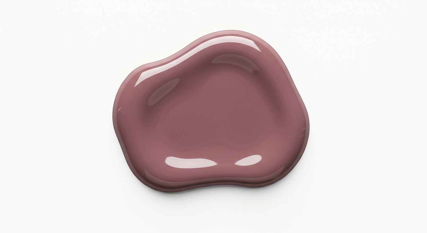
That search for a happy medium between trendy and timeless explains why Benjamin Moore landed on Cinnamon Slate as its Color of the Year 2025. At first glance, it might seem like a strong rebuke of Raspberry Blush and Blue Nova, the brand’s highly saturated 2023 and 2024 Colors of the Year, respectively. In truth, Cinnamon Slate represents less of a break from the recent past than the continuation of subtler trends bubbling up to the surface.
Specifically, says Andrea Magno, Benjamin Moore’s director of color marketing and design, Cinnamon Slate takes some of its color philosophy cues from the “easy to live with” shades included in the brand’s 2024 Color Palette, like Regent Green, Antique Pewter, and Hazy Lilac.
Fittingly, that shift from bold, clear colors to a greater sense of depth and intrigue were central to Benjamin Moore’s process.
“One of the things that really stood out for this year was diving into the complexities and nuances of color, talking about undertones and thinking through what makes a given color special,” Magno tells PRO. “The catchphrase we really latched onto was ‘quietly colorful’.”
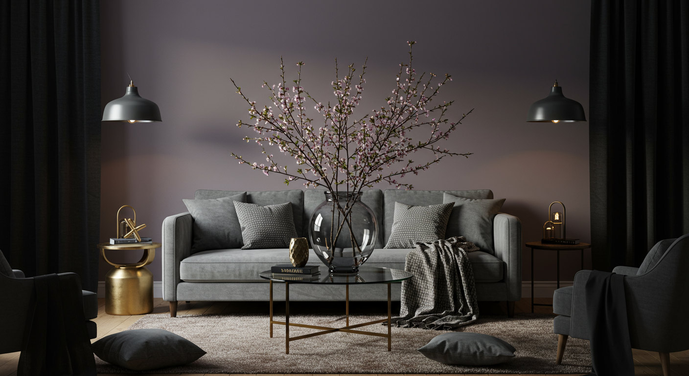
So what exactly makes Cinnamon Slate quietly colorful? In this case, it’s all in the details just beneath the surface. Compared to some of the 2024 colors previously mentioned, Cinnamon Slate warms things up with the introduction of red undertones. Depending on the lighting, one might perceive the pigment as an earthy, grounded near-brown, or as a violent-tinged shade that harkens back to Hazy Lilac.
Become an AD PRO member for only $25 $20 per month.
Tactility is also an essential part of Cinnamon Slate’s color story. Magno cites the “velvety” and “softened textile” feel of quietly colorful shades like this, which pair perfectly with soft, rounded-edged furniture and cozy-yet-classy materials. Of course, its brown-tinted qualities also mean Cinnamon Slate feels right at home with wood materials and finishes as well.
The Color Palette of 2025, According to Benjamin Moore
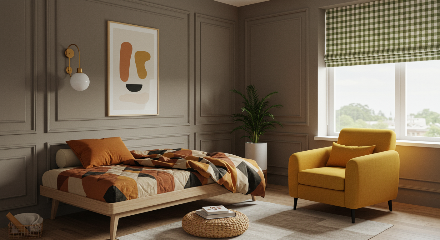
The nine other “hushed hues” that comprise Benjamin Moore’s 2025 Color Trends Palette hint at some of Cinnamon Slate’s underlying enigmatic qualities while remaining versatile enough to allow for self-expression. Despite its name, Glacier White offers an inviting warmth that helps it stand out from a crowded field, while fellow neutrals Paris Rain, Sea Salt, and Tissue Pink alternately mix in gray, beige, and even wisps of rose to offer more than initially meets the eye.
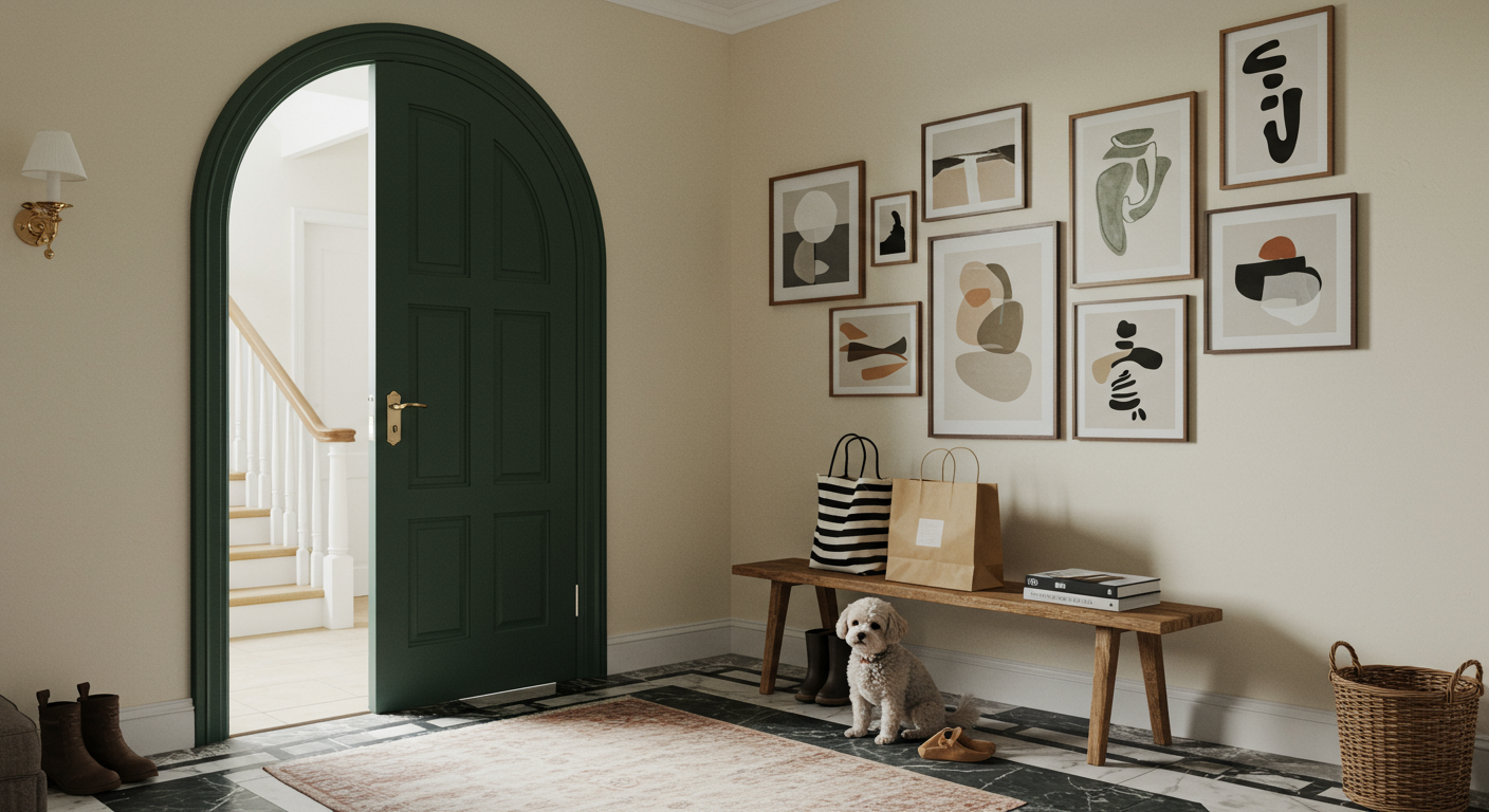
Leather Saddle Brown and Chowning’s Tan take Cinnamon Slate’s hint of brown a bit further, without losing its sense of balance and timelessness. Nodding to some of the recent lush yet relatively soft hues that pointed Benjamin Moore towards Cinnamon Slate in the first place, Stained Glass pumps up the blue undertones while Ashwood Moss and Rosepine keep nature-tinted greens in the conversation as we head into 2025.
Though capable of standing on their own and fitting the zeitgeist, Magno believes these colors that “you just really want to envelop yourself in” offer an ideal blend of comfort and creativity. “Even though they’re in a trends palette, they’re going to be gorgeous year after year,” she says. “You can play with these 10 colors and come up with a lot of different ways to use them while still putting your personal stamp on it.”

